한국어 리뷰는 여기로.

“We’re inspired by some of those innovations (in iOS). And we want to bring them back to the Mac.”
Steve Jobs said this as he introduced OS X Lion in last October. iOS was based on OS X, and made a lot of innovation in the past four years of its life, some of them even more innovative then its father.
Now, it’s time for the father to learn back from its son. So, how did that work out?
Install
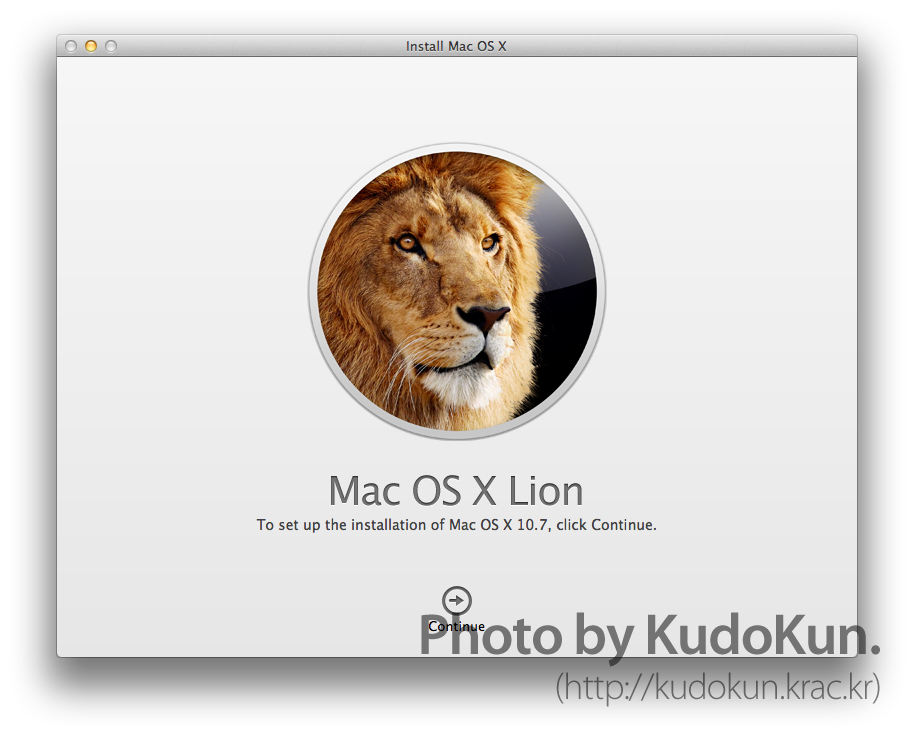
OS X Lion’s installation process can be described as either most innovative, or most radical.
Firstly, the proper way to install Lion is to buy it from the Mac App Store. If you think about installing operating system, it usually involves a disc put into the computer, then go through 40 minutes of some gibberishes. But, with Lion, you download the install file, launch it, and let it do its thing, and you’re done. The whole process took about half an hour on my early 2008 MacBook Pro, which is from equal to faster than that of Snow Leopard.
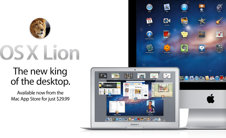
If you happen to live in an internet dark zone, Apple has got some solutions for you: you can either get a little help from Genius Bar in Apple Stores and download it there using the stores’ blazing fast WiFi, or you can buy a USB stick that contains Lion. Just letting you know, the thumbdrive costs $69, a $40 premium over $29 from the App Store. (But with this, you may be able to update to Lion even from Leopard.) You can clearly see that Apple is trying to make you install it from the App Store.
Overall Look and Feel
When you first boot Lion, the new login screen greets you. There are bubbles of icons resembling each account on the brushed-metal-looking background which clearly is from the iOS. It does remind me of the login screen from the company up above, but while the Windows 7 tends to be vibrant and fancy, Lion kept things simple.
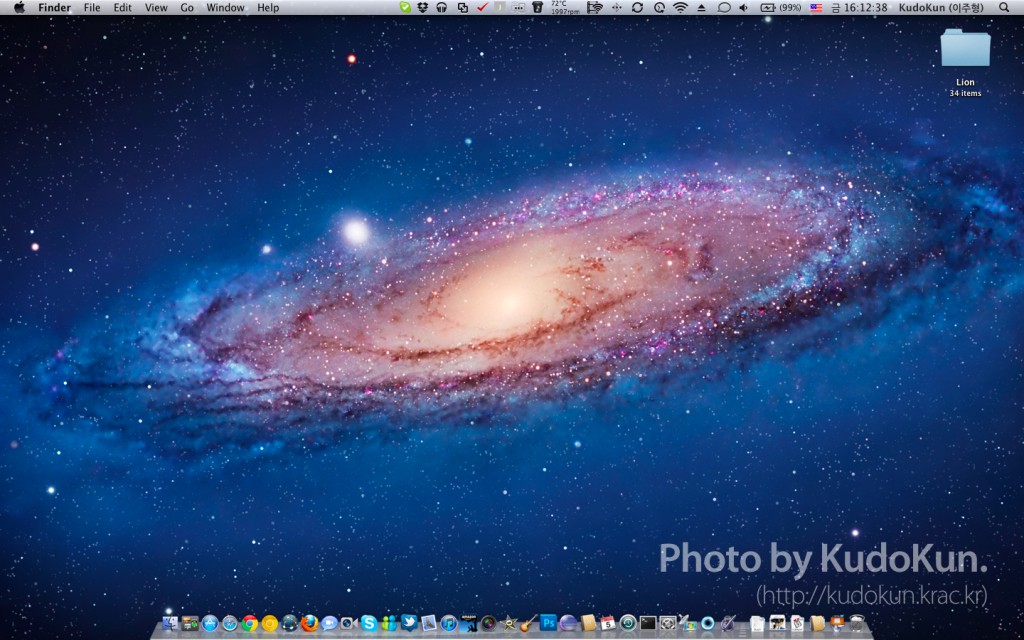
After the login, you’ll be greeted with something very familiar. The desktop itself hasn’t changed that much from that of Snow Leopard. But there are subtle changes enough to confuse you.
When you first login to Lion after the install, it tries to teach you about the new inverted scrolling. It’s basically scrolling in a computer as you know it, only in backwards. It sounds simple, but it takes time to get used to it. Apple took this idea from… iOS, obviously. Just try to do the scrolling in an iPhone or iPad. You’ll get what I mean. Of course, scrolling on a Mac is rather indirect that scrolling in iOS, so it takes time to get used to it. It took me about half an hour to get used to it when I was using Developer Preview (it took longer to go back the conventional scrolling when I came back to Snow Leopard), but if you insist that you’ll never get used to it, you can revert it in System Preferences.
Influence of iOS doesn’t end on scrolling. Not only now the scroll bar disappears when you don’t need it, but now the whole scrolling has that rubber band feeling from iOS, such as the bouncing action when you reach the bottom.
Finally, the design of selection buttons, progress bars and window action buttons has changed. They look cleaner than those in Snow Leopard.
Gestures
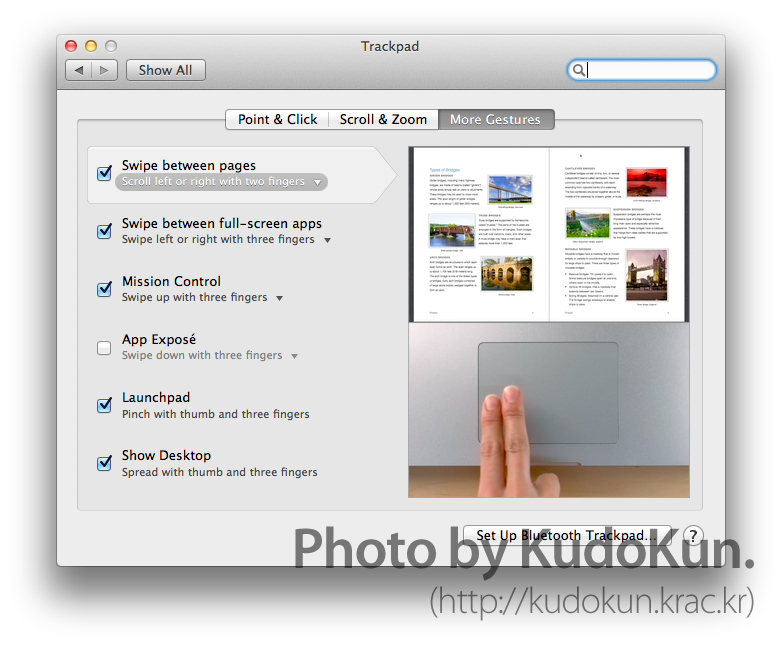
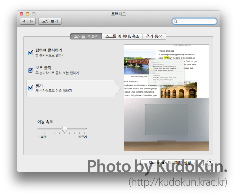
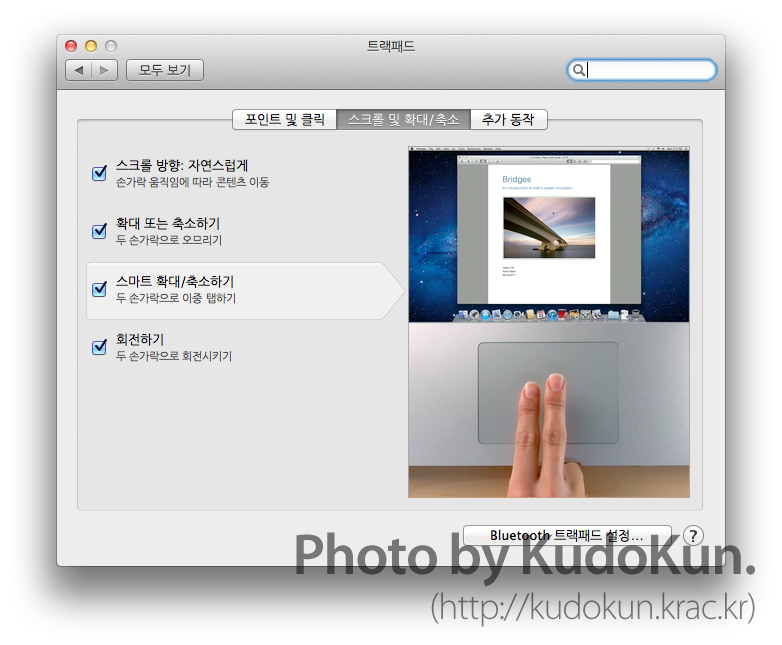
Lion has various new gestures. Listing all of them would just hurt my fingers, so that’s one of the three pages of gestures info.
If you use those fancy new MacBooks, these gestures are pretty welcoming. If you have older ones or have older hardware accessories, $30 won’t be the minimum of money you pay as you upgrade to Lion. Not only getting used to these new gestures is a task, since Apple did change things around a lot, but if you have older generation of hardwares that don’t have multitouch pointing input, things aren’t easy as you try to navigate through. Even my two-year-old Magic Mouse, with Apple’s customization trying to fit in the gestures for Lion, struggles. At least my MacBook Pro was the first to have multitouch trackpad, and that even struggles in some of them because it has less space than the trackpads in new ones. If you use mice other than Magic Mouse, you’ll probably need to blast through about $69. I personally recommend Magic Trackpad.
Lion represents OS X’s complete transition to gesture-based navigation, so if you don’t get used to it, you can never use Lion to its full potential. Not to say you won’t be able to use it, but gestures provide so many shortcuts to otherwise tedious tasks. Making matters even worse, Apple decided to change around almost all the gestures, so even the Mac faithfuls will need some time to get used to these gestures. I think Apple went way ahead into the future on this one.
Launchpad
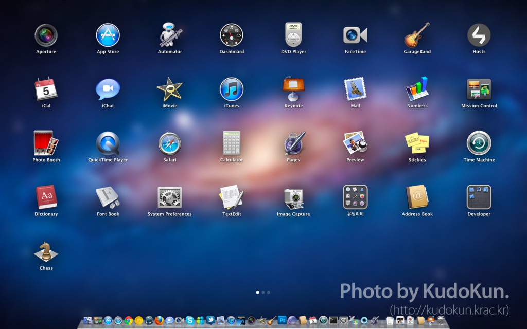
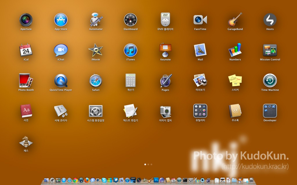
Let’s talk about something else that I didn’t like about Lion. The Launchpad. When you turn it on, the Mac becomes a 15-inch iPad. That’s how I felt about this. Sure, I’m used to this view on my iPhone and iPad, but do I really need to see this on my Mac? Even worse… I have to organize this stuff. It has all those jiggly actions that Steve loves, and you can even uninstall an app from here, though that app has to be downloaded from the App Store. You can even create folders, using same actions as its iOS counterpart. I see no point in this. I already have great app organization tools such as Dock and Stacks, why do I need a third way?
Full Screen
Lion finally supports full screen view of an app. Although it’s quite a late foray into this charted-by-Windows territory, Apple has decided to do things a bit different: Lion assigns a Space to each app that is in full screen. This move maximizes the use of the screen real-estate, which really is a boon for users with a small screen, such as 11-inch MacBook Air or 13-inch MacBook Pro. The only problem with this is that once in full screen, there’s no way to use the secondary display you have. This is perfectly understandable on an iPad, which has NO secondary display, but it’s no excuse on the Mac.
Mission Control

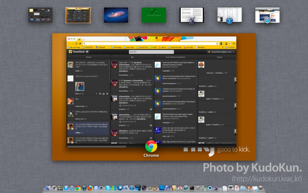
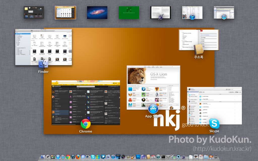
Let me just get this out of the way: Mission Control is my favorite new feature of Lion. I have to be honest, I’m an Exposé junkie. It makes navigation through windows that quick, and I never thought there would be a way to improve this. And well, Apple has done it.
Mission Control is Exposé on steroids, then eating up Dashboard and Spaces. When launched, you can see the Exposé of current Space, then previews of the other Spaces, Dashboard, and even apps in full screen. You can then swiftly navigate into other space you have to go. Also, using multitouch gestures, you can swiftly navigate through spaces. If you have various full screen apps running, Mission Control is a must-have.
One gripe that I have about it is that you cannot move Spaces around. The manual (and very confusing) way to do it is to to click on the icon in the Dock, making it to move up on the list. But I need something stronger than this. It is really confusing because I distinctly remember Snow Leopard could rearrange Spaces with no problem.
Auto Save and Versions
It’s 3 AM. You have a paper due the following morning. You’re working on that very paper. Suddenly, your whole apartment complex lost power. Your computer, being a desktop, loses power. First, surprise comes to you, but then it is suddenly eclipsed by the worst panic you’ve experienced. “I lost all of it! What am I supposed to do?!” Next day, you explain what happened to the professor. Some would give you extension, but most would say this: “You should’ve saved.”
That is right, saving whatever you’ve been doing is something you have to learn as a second nature. People learn it, mostly through the hard way. However, Apple has thought, ‘If users have to save their documents all the time, why do they have to do it?’ Thus comes Auto Save, a concept that Apple has also borrowed from iOS. If you think about it, whatever you do on an iPad, everything auto saves. Have you seen an app saying “Would you like save what you’ve done?” as you exit to home screen? Probably not.
Lion saves every single change done on a document and such on system-wide. (In order to save space, it only saves on a delta basis.) Thus, even if the event described above occurs, since the system already saved the document for you, you have much less work lost. Heck, you might not have even lost anything.
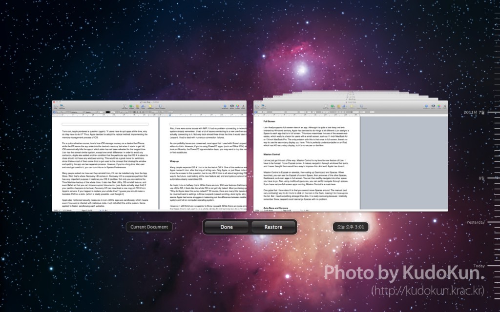
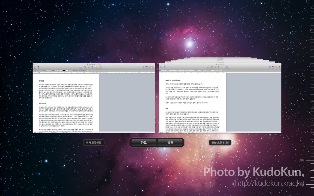
It doesn’t end there. Apple has more tricks up its sleeve when it comes to Auto Save. If you like the current version, you can lock it, so that the system does not overwrite what you like, or you can create a duplicate, so that you can save the version you like as a separate file, and work from there. However, the best thing about all this is the restoring the previous version. Remember what I’ve said about Lion saving all the deltas on your file? Well, now it shows all the changes you’ve done over time, something like Time Machine, but for your document. It even has a Time Machine-like interface. You can compare previous versions to the current version, and you can restore it, or you can even pull one thing (i.e a picture that you have deleted in the current version) from a previous one into the current version.
Auto Save has a potential to change the old habits that you always forget. One thing to reflect that is that as of this writing, I have never pressed save button on Pages. Of course, Auto Save is a separate Lion API that developers have implement to their apps, so future of not saving your progress every damn second is still little distant. But, it’s not as far as it used to be.
Resume
Resume feature is simply put, loading up the previous state before the app was quit when it is re-launched. For example, if you quit Safari (or Safari crashes) and re-launch it, Safari would have all the tabs that you had opened saved in its memory to pull it up. Not only just in apps, but Lion also supports Resume on system-wide, restoring all the apps and sessions in those apps that the user has kept opened before shutting down the system. This is a great feature, but it’s greatly performance-driven. I’ll get onto that in performance section.
Managing your Life and Accounts
I like to call Mail, iCal, and Address Book “Life Manager” apps. Past three years since I’ve started using the Mac, these apps has become essential part of my life. And now, those apps have changed in a big way.
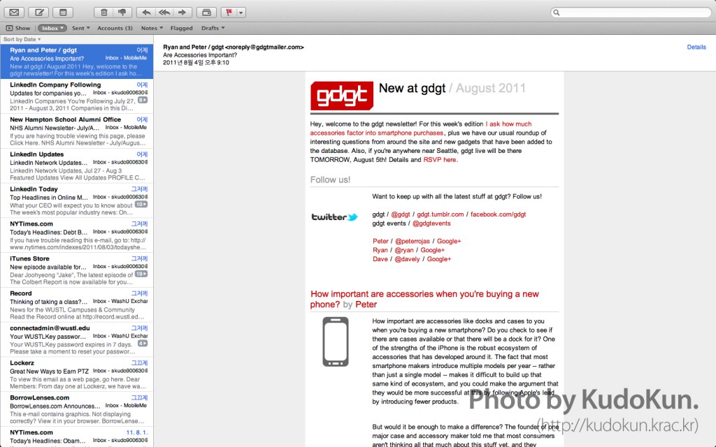
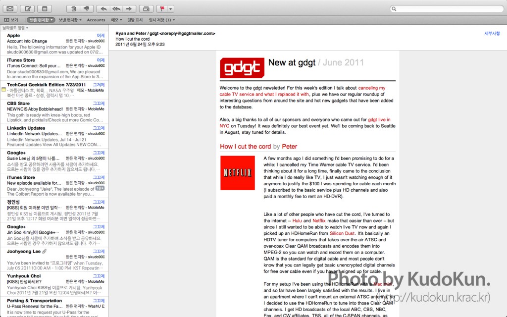
Let’s start with Mail. Now it look pretty similar with the iPad counterpart. While the old version had a vertical split view of message list and the actual message on the right, and list of folders on the left, now it’s horizontal split view, just like the iPad if you look from landscape. I think this method uses the screen estate much more efficiently. Also, now you can hide the folder view on your left, and drag folders you visit the most to create something like Bookmarks Bar in Safari. Finishing it all off, now the Lion client also supports conversation threads, just like its counterpart in iOS 4.
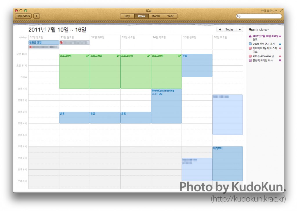
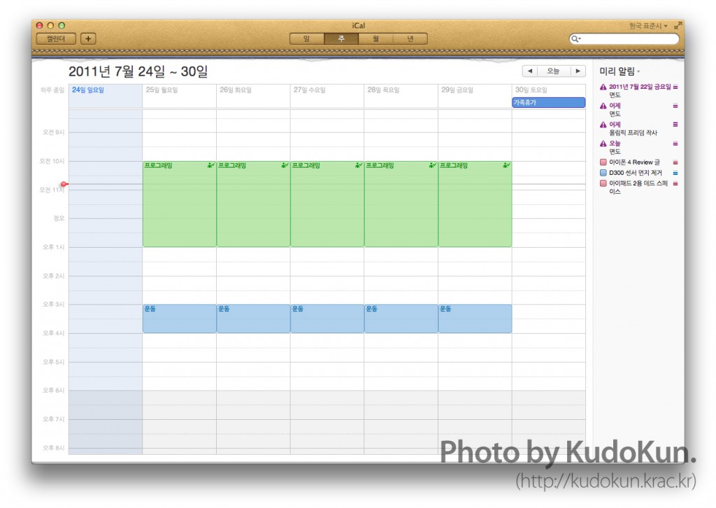
Now, onto iCal and Contacts. Let me just say this: they’re a complete ripoff of the iPad version. Even to its book-like design. I already know my good friend Alex Slover hates this, but I did hear there’s a third-party workaround for this. But let’s just move on from that.
 While Contacts hasn’t changed that much except for new looks, iCal went through significant changes. First, Reminders (also a new feature on iOS 5) has moved from Mail (which was Todo) to iCal, which seems much more appropriate place. Also, it features new day view (which was already there in iPad) and year view (also a new feature in iOS 5), and you can add events quickly via Quick Add. Say, if you type it “Quick meeting at 3 PM on Tuesday”, iCal automatically figures out the timestamp and automatically adds the event for you. Also if you have not entered time, it switches the event into an all-day event.
iCal and Contacts also finally supports push update. While until Snow Leopard, you had to wait for the whole system in 15 minutes interval to sync, now with Lion, each app can push the update right after the change occurred.
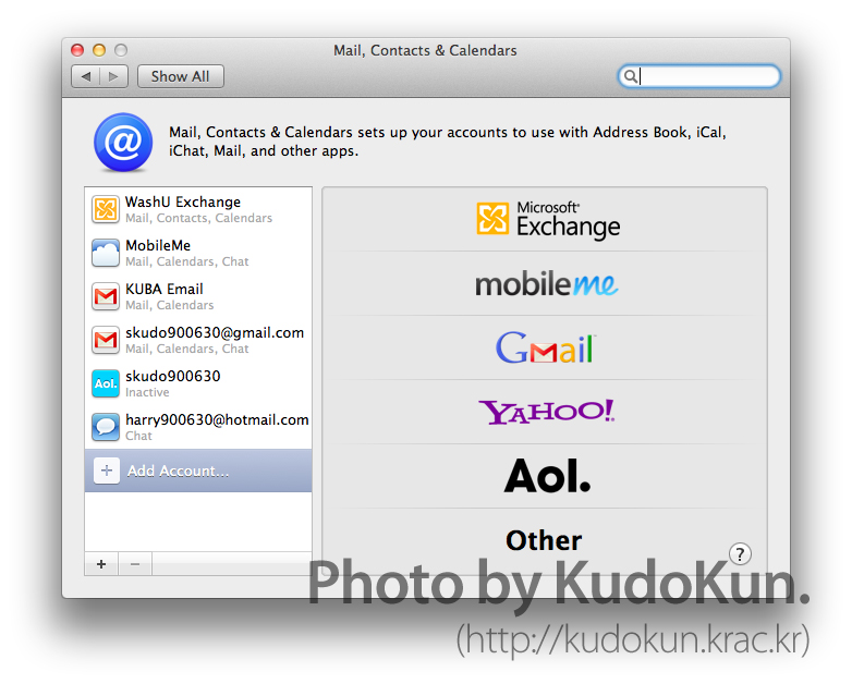
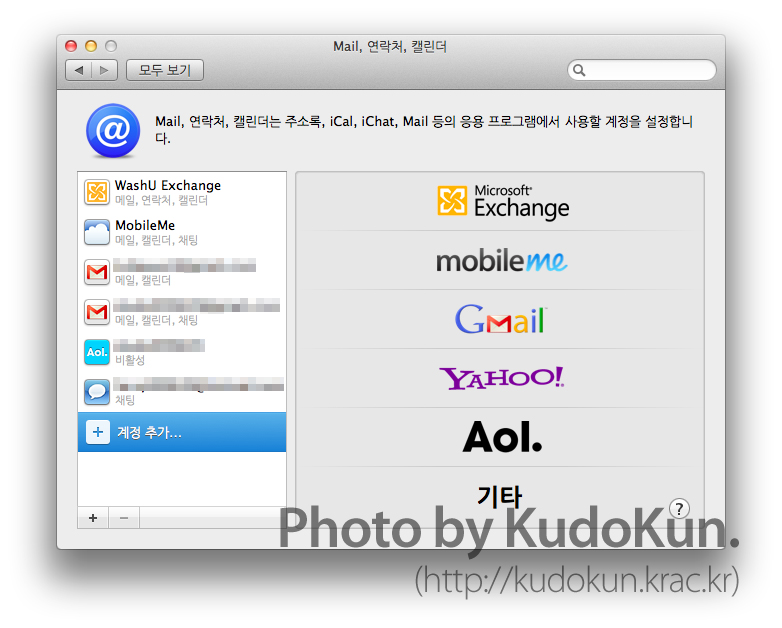
Last but not least, Lion features the new Accounts menu in System Preferences, just like iOS.
App Store
While the App Store was already came with an update in Snow Leopard, it is finally integrated into Lion. Lion supports in-app purchase, delta updates, and also push notifications, allowing apps to notify you even when the app is not running.
AirDrop
AirDrop enables users to wirelessly drop files into other Lion-supporting Macs. It is directly integrated into Finder, and when there’s a AirDrop-supported Mac in vicinity, it shows up in AirDrop tab. And then you can directly drop a file, and when the receiver accepts the file transfer, the file will transfer into the receiver’s Downloads folder. It does not even need a WiFi network, since AirDrop supports peer-to-peer connection. Sadly, AirDrop has hardware requirements, and my old MacBook Pro did not meet it.
Other small stuffs
With the new QuickTime X on Lion, you can merge multiple clips, and also export audio from the video, which was a missing feature from QuickTime 7 Pro.
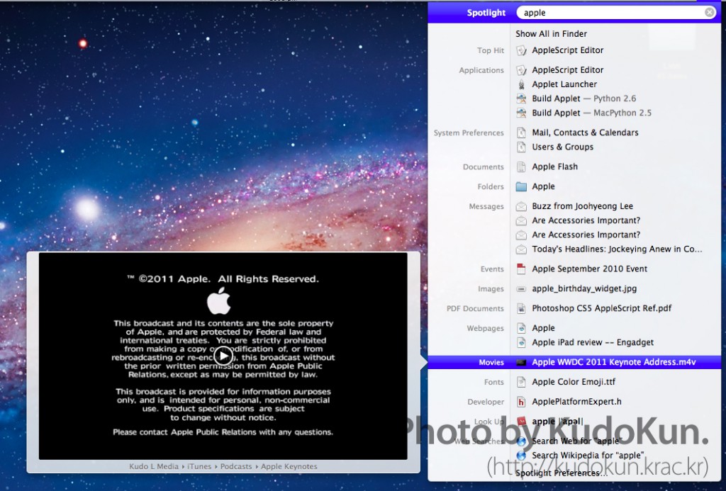
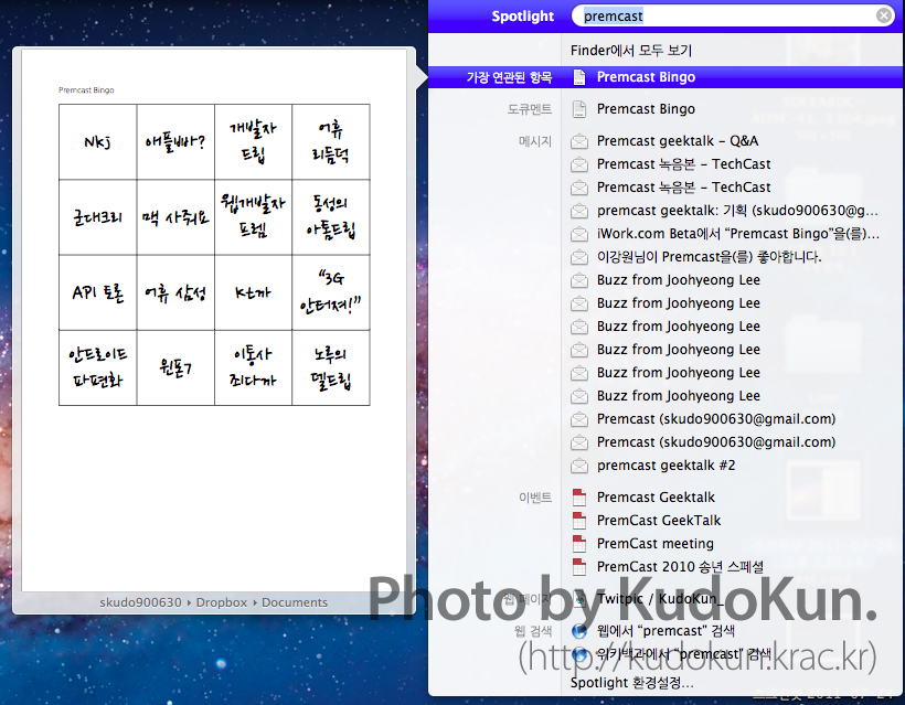
Spotlight has seen multiple improvements as well. Firstly, you can drop the file you’ve found on Spotlight onto Desktop. This will make a copy of the particular file, making the file much easier to do tasks such as uploading it using a web browser, or sending it through email. You can now also search the web or Wikipedia directly from Spotlight, and it finally supports Quick Look, not only the file, but also cached websites. Thanks to all these new features, Lion takes much longer to index in the first boot. I advise you to leave it alone. Especially if you’re using an old Mac.
iChat finally supports tabbed chat window, so that you don’t have to leave messy chat windows on the desktop. What still baffles me is why is this and FaceTime still not integrated to each other.
In case of Finder, things are much simpler. Maybe, way too simpler. My personal gripe is that the additional pane that shows the remaining storage space of the specific drive is invisible by default. I figured out a way to turn it back on, but I don’t know why Apple is way too overdoing itself when simplifying the computer operating system.
System

If you buy the new MacBook Air or happen to clean install Lion, very confusing instance occurs: the light that indicates an app is open is no longer there. To walk back a bit, this was standard in Developer Preview version of Lion, even when you have actually upgraded from Snow Leopard. This caused a bit of chaos for all-time (or old-time) Mac users. “How am I supposed to know if an app is turned on?!” This is kinda important, since closing a window doesn’t mean the app is fully quit unlike Windows, so you have to quit it so that you can manage memory.
Turns out, Apple pondered a question (again): “If users have to quit apps all the time, why do they have to do it?” Thus, Apple decided to adopt the radical method: implementing the memory management process of iOS.
For a quick refresher course, here’s how iOS manage memory on a device like iPhone: while the OS saves the app state into the device’s memory, but when it starts to get full, iOS automatically kills the app of which state has not been reloaded for the longest time. Lion has the almost similar system, except one small difference: in order to avoid any confusion, Apple also added another condition that the particular app that OS X is about to close should not have any windows running. This would be a great move for switchers, since it takes most of them some time to get used to the concept that closing the window and quitting the app are two separate process. However, if you’re a long-time Mac user and can’t get used to it, you can turn this on in System Preferences.
Many people asked me how can they reinstall Lion, if it can be installed only from the App Store. Well, that’s where Recovery HD comes in. Recovery HD is a separate partition that has very important purpose: it restores your OS X partition. Not only you can restore the Time Machine backup of the whole drive, it also has Disk Utility, OS reinstall feature, and even Safari so that you can browse support documents. (yes, Apple actually says that) If your partition happens to be bust, Recovery HD can download a new copy of OS X from Apple’s servers. If you happen to replace your whole drive? I guess you should make a bootable DVD or a stick. (which is totally possible. Just Google it)
Apple also reinforced security measures in Lion. All the apps are sandboxed, which means even if one app is infected with malicious code, it will not affect the entire system. Same applied to Safari, sandboxing each websites.
(Oh, and answer to the question above? It’s Safari and Chrome.)
Performance & Compatibility
With Lion, Apple cut down the support of Macs with Core Duo CPUs in. With that in mind, Lion definitely feels heavier than Snow Leopard. However, once everything was in shape, it ran quite smoothly.
The biggest problem though, was the booting process. It takes about twice as long as Snow Leopard took. And when you use Resume feature to bring back all the apps you’ve used before the Mac shut down, it takes even longer. I guess this won’t be big of an issue on a system with faster hardware (or even just SSD), it starts to become an issue when you have slow hardware, like myself. I ordered a new hard drive to counter the issue, so let’s see how it goes.
Also, there were some issues with WiFi. It had no problem connecting to networks that the system already remember, it had a lot of issues connecting to a new one from scanning to actually connecting to it. Not only took almost three times the time it would take in Snow Leopard, I had to deal with numerous connection failures.
As compatibility issues are concerned, most apps that I used with Snow Leopard ran without a hitch. However, if you’re using PowerPC apps, (such as Office 2004) since Apple took out Rosetta, the PowerPC app emulation layer, you may want to buy the new version or find substitutes.
Wrap-up
Many people expected OS X Lion to be the last of OS X. One of the evidence was that Apple named it Lion, after the king of all big cats. Only Apple, or just Steve Jobs even, may know the answer to this question, but to me, OS X Lion is all about beginning OS X’s long way to the future. Just looking at the new feature set, and and quite an amount of system automation clearly resembles iOS.
As I said, Lion is halfway there. While there are over 250 new features that improves the use of the OS, it feels like the whole OS is not yet fully baked. Most pondering question is, “Why did Apple take this out as default?” Of course, there are many little tweaks that can be reverted back to settings in Snow Leopard (natural scrolling, dock lights, etc), but it seems Apple had some struggles in balancing out the difference between mobile operating system and full-on computer operating system.
However, I still think Lion is superior to Snow Leopard. It clearly still is a step forward, and better, with all these new features, it only costs $30. I just hope you’re good with getting used to changes.
Pros:
- Simple install
- Pretty convenient system automation
- Mission Control
- 30 bucks for an operating system.
Cons
- Launchpad is useless
- Gestures that take some time to get used to.
- Natural scrolling (easier than gestures, but still takes time)
- Sometimes, way too much simplified system.
Score: 8.5/10
Buy (Mac App Store)
