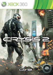
Title: Crysis 2
Developer: Crytek
Publisher: EA
Platform: Xbox 360, PS3, PC
Genre: First-Person Shooter
Metacritic: 85 (360) / 86 (PS3) / 87 (PC) (Data gathered at 4/7/2011)
(한국어 리뷰는 여기로)
To PC gamers or PC tuners, the name Crysis is a great value. Even three and a half years after its launch in November 2007, Crysis is still treated as a benchmark of how powerful a computer is. Many people still tout their computers by saying, “My computer can run Crysis in highest settings at XX fps!” (Though it should be noted that most graphics cards these days can run Crysis with no problem, if you give up the ‘highest settings’ part.)
One thing that was much desired in Crysis was that it felt like Crytek did not put much of their time into gameplay, compared to the insane presentation. Pacing in story was quite dreadful, from very slow and sometimes ‘boring’ start, to a sudden progressions in the end that makes you very difficult to comprehend. In addition, while controlling Nanosuit is not that difficult, but it is also not streamlined enough for you to quickly adapt to situations, which results in an instant death if your ‘plan’ goes horribly wrong. (At least in higher difficulties.) Oh, and multiplayer? I didn’t even know that it had it. (I actually had to revise the Korean version, since I wrote, “there’s no multiplayer.”)
Then there were some variations, such as Crysis: Warhead, a retelling of events in Crysis, and multiplayer-only Crysis: World, and finally, after three and a half years, the real sequel, Crysis 2, is upon us. Did it fix the problem? Or is it just another technical demo?
[youtube]http://www.youtube.com/watch?v=dmGAfgv9uPo&feature=player_embedded[/youtube]
(Visit here for Mobile)
Crysis 2 is situated in 2023, three years after the story concludes in the first Crysis. An unforeseen epidemic of huge proportion starts to infect Manhattan. Soon, U.S Department of Defense declares martial law on the area, and makes a contract with CELL, an elite mercenary unit owned by Crynet, to be deployed. Meanwhile, U.S Marines are deployed to pick up Dr. Nathan Gould, who potentially has a solution to the outbreak, and they are immediately attacked by Cephalopods (Cephs for short), an alien race also present in Manhattan area. Only a marine by callsign Alcatraz survives, and is picked up by Prophet, the leader of Raptor Delta Force team in Crysis. Considering that he’s also infected with the virus, Prophet decides to hand over his Nanosuit to Alcatraz. Now, it’s up to Alcatraz to save New York.
In Crysis 2, it’s already apparent that Crytek is trying to push out Crysis as a series. (Crytek did say they intend to makes this story arc a trilogy.) Pacing is much better than the first game this time around, but still it has a lot of the important plot points in the back. I was hoping for a more even distribution of plot points, but still, it’s much better than the first Crysis.
The another problem with the story of the game was that it doesn’t tell you much. It doesn’t tell you much about the major factions (like CELL and the Cephs), about the major characters (especially Gould and Hargreave), and while it does not have too many throwbacks to the first game, but then where there is one, it’s totally impossible to understand. (Especially, if you have not played the first Crysis, you’d have no idea what Tara Strickland’s father did.) The game also does a very poor job at explaining what Prophet was doing for past three years after the events of the first game. Rather than poor, it does absolutely nothing. These facts all lead up to a reasoning that Crytek is intending to release some sort of prequel to Crysis 2, as something like what Warhead was to the original Crysis, but nothing is confirmed at this point, thus leaving players very confused.
Finally, ending is difficult to say it’s a straight-up cliffhanger. It is a good thing, since it does wrap things up quite nicely. This is quite a direct comparison to the first one, which ended in one of the worst cliffhangers in game industry. (With Halo 2 still topping it.) Funny thing is, none of the characters from Crysis with the exception of Prophet made a comeback in Crysis 2. One speculation is that they may be saving that for Crysis 3. It was even rumored that Alcatraz was actually Nomad, main character from the first Crysis, which turned out to be false.
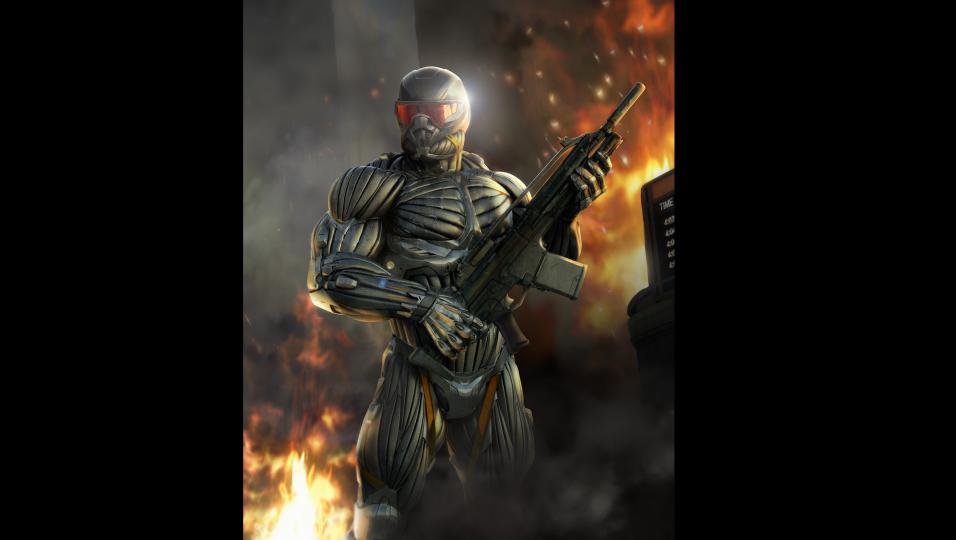
Nanosuit makes up a huge portion of gameplay in Crysis series, and that’s no different in Crysis 2. As aforementioned, Nanosuit’s time efficiency in control was not great in the first Crysis, but Crytek managed to fix a lot of those issues in Crysis 2. Firstly, now Nanosuit has only three distinct suit modes: Armor, Cloak, and Power, which combines Strength and Speed from the first Crysis. Power mode is now automated. For example, when you run, speed mode automatically kicks in. When you need to use maximum strength, in situations such as when you kick a car, or throw an enemy (Yup, that’s still there.), strength mode automatically kicks in.
Also, now you can switch your suit mode with just a button, rather than having a select wheel a la weapon selection screen in Assassin’s Creed II and Brotherhood. (The only difference is, the suit mode selection screen in Crysis did not pause the game, while Assassin’s Creed does.) This is more like a move in order to make a smooth transition to console controllers, (Xbox 360 version uses two bumpers for mode keys) but it’s now much easier to quickly switch your tactics in the middle. For example, when you are busted while cloaked, you can quickly trigger the suit to go into Armor mode for an epic firefight, and quietly disappear again by quickly cloaking yourself again. Of course, you have to manage your suit energy carefully. Of course, there still is an option for PC users to use the wheel if you so desire.
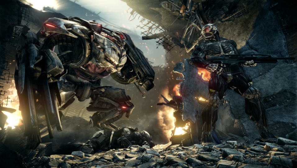
Another aspect that makes this game much more realistic is enemy AI. It’s pretty darn smart. It’s pretty much on par with AI in Halo: Reach, but in a different way. You see, there are some scenes where the player can take out each one of the enemies in a sandbox like predator gameplay in Batman: Arkham Asylum. (But then, unlike Batman, you can avoid them as a whole if you desire.) In this instance, enemies are much more actively engaged in finding you, and also reacting to a teammate’s disappearance is much more realistic. (Not to say that AI in Arkham Asylum was dumb.) In CELL’s case, they even call backups, so that makes taking them out one by one a lot more difficult. In my case, there was a part that took me 20 minutes to get through, thanks to CELL soldiers keep calling in backups, and I felt like I had to take them all out. On the next playthough though, I just sneaked past them and decreased that time to 5 minutes. But this AI also has a terrible bug where the soldier would just run around in circles, or helplessly watch as his teammate is taken out right in front of him. But this does not happen that often. For me, it was a lot more fun to play with CELL, since Cephs react much more quickly to my presence while cloaked, so I got annoyed and killed them all on Armor mode.
Overall, the AI and the choice that Nanosuit gives you make up to be a very satisfying experience with a lot of replay value. As I review the game, I’m on the third run, but it’s never boring. You can try different tactics each time. Actually, I even managed to find a secret passageway that I didn’t find in the last playthrough.
You can also upgrade the Nanosuit itself. You gather up something called Nano Catalyst when you kill a Ceph. This acts as a currency towards the upgrade of your suit. You have four categories with three perks in each category. Though you can unlock them all and make the ultimate Nanosuit, you may only choose one perk in each category, keeping the game in balance and adding variety to the gameplay, since you can change the perks on the fly. Also, since these upgrades are kept through the different playthroughs of the campaign, you can upgrade your suit in easier difficulty settings and tackle on more difficult playthrough with your suit maxed out. Some of the important suit upgrades include using much less energy while cloaked, and dramatically boosting charging speed of the suit energy.
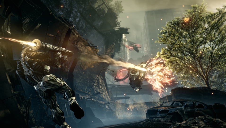
- Fox three!
Campaign aspect of the game can be cleared in about 12 hours, which is very respectable compared to mere 5 hours of Modern Warfare 2. While pacing is not top-notch, the set-pieces are evenly placed to keep you hooked to the game, and replay value, with all these upgrades and various collectibles, is pretty high, if you are an achievements nut.
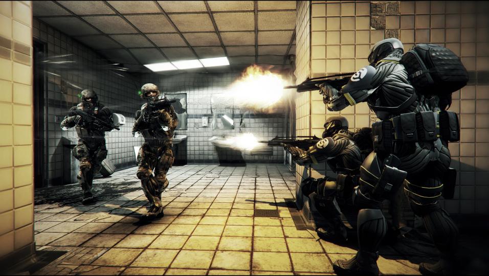
However, that is not all: there is also multiplayer to talk about. I personally don’t play multiplayer that much, but I played it anyway for the sake of this review. Basic premise is that marines and CELL fight in Nanosuits (much weaker than the kind that Alcatraz wears, I might add), but it’s a mixed bag when it comes to the differentiated experiences. You have kill streaks (though it’s differentiated by each map), perks, and level-up system, much more like Call of Duty and other shooters. While the utilization of Nanosuit does make the gameplay more interesting, it’s not enough to add a whole lot of difference from other shooters. But then, everything is pretty well-balanced, so you can have good fun through the multiplayer.
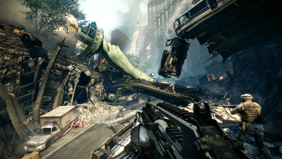
- It’s just jaw-droppingly gorgeous.
Now let’s talk about the presentation, something that many are really looking forward to. To start with the conclusion, it is not a dramatic upgrade from the first game. In fact, some of the aspects has dropped back. For Crytek’s defense, they also had to think about the console versions now, so they have gone through a lot of optimization, which comes out in sacrifice of some of the textures as well. However, the optimization has worked: despite all the concerns, Crysis 2 runs quite well on consoles, while there are still some frame rate hiccups from time to time. It is one of the best graphics quality ever seen on (at least) 360, and I thought I’d never say this since Halo: Reach. (In some ways, it is much more optimized than Reach.)
Thanks to the optimizations that was very needed for consoles, while the overall graphics quality may not reach the pillar of the original Crysis in general, but there are some aspects that the successor excels over predecessor. Firstly, the light effects are truly great. Especially when there is a sunset, it’s almost like a photograph. Secondly, the facial animation and facial textures are greatly improved. You can see the improvements clearly even from the beginning of the game. Finally, physics is top-notch. Since the game is situated in New York in ruins, it tends to collapse everywhere, and those scene are pretty realistic. It’s one of the best physics engines I’ve ever seen since Star Wars: Force Unleashed. While I still recommend PC version for the true graphics prowess and optimization that Crysis 2 can offer, most of the hardcore PC gamers may be disappointed by lack of options, (There are only high, very high, and extreme. You can’t even dare to go medium) and some aspects that Crytek thought of console gamers way too much. But then, console versions are no slouch, either, and Crysis 2 still has top graphics even among both the console and PC games, daring other developers to follow their footsteps. (Or, use their CryEngine 3.)
The sound is also fantastic on Crysis 2. I was very impressed by the realistic sound effects in distance, especially in gunfires. Also, the music score, partially written by Hans Zimmer, is also pretty good. Although the characters were disorienting, the voice acting was not as bad as the characters themselves.
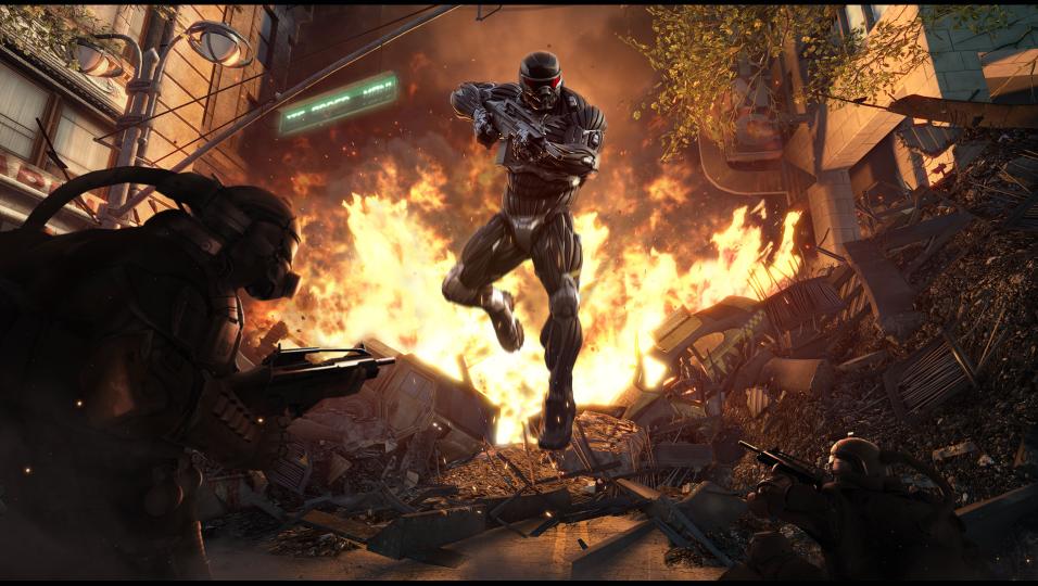
- You’re on.
To sum things up, to the question “Is Crysis 2 another tech demo?”, I’d like to answer a firm no. The graphics departments may have dumbed down a little bit, Crysis 2 feels much more like a very well-made game. Sure, there are some plot holes that may confuse players, some unfortunate bugs, and multiplayer is pretty generic. But as in the overall package, Crysis 2 gives much better potential to the whole Crysis series, and is the chief reason that I personally can’t wait for Crysis 3. (Or some other expansions.)
Final Verdict: Crysis 2
Strengths
- Vast tactical choices thanks to Nanosuit and enemy AI
- Nanosuit controls are much more streamlined
- Still one of the best looking games ever, now with more optimizations as standard.
- Long and exciting campaign with epic set pieces.
Weaknesses
- Multiplayer is pretty generic
- Story pacing and sometimes forgettable characters
- Not much options towards PC users
- AI bugs and framerate issues
(I just put it in here to even things out)
Final Score – 9.0/10
(This review is largely based on retail version of Crysis 2 for Xbox 360. Cleared campaign twice on normal, currently going through the third run on Supersoldier, the second-most-difficult setting. Nanosuit is fully upgraded, and 29 out of 50 achievements unlocked. Multiplayer level at 13.)
