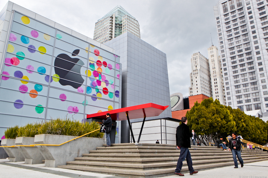
As all of you may know by now, there is an Apple event going on tomorrow. And, judged by the invitations Apple sent out, it’s for sure it will at least be honest with the iPad 2. But, let’s be honest: even if iPad 2 had cameras, smaller and thinner profile, and new hardware, it does not mean anything if it just has iOS 4 onboard.

If we recall the past, however, with the exception of iOS 4 last year, the annual iOS event was held in March. So, we can possibly assume that iOS 5 will also be unveiled tomorrow. Also I saw someone from some blog named Technobuffalo ranting on about what iOS 5 should have. Before we move on, I’ll say this: I’ve used both iOS and Android, and I would still choose iOS over Android for its attention to detail. There. I said it.
Well, with that aside, iOS 5. What’s up?
Complete UI Overhaul
This is actually more like a personal wish. iOS, after its debut with the iPhone in 2007, maintained same interface until now. That’s four years, in case you can’t count. Of course, Apple added Webclips, icon rearrangement, Spotlight search, Folders and wallpapers into the mix, but the basic premise has not changed. Especially, if you compare the iOS to new OS like Windows Phone 7, it looks outright old.
However, I see how Apple will oppose this. The biggest factor is of course, ‘user-friendlyty.’ (If that word exists) Apple is proud of iOS as the easiest smartphone OS to use, and I do not disagree. However, if there is a complete UI overhaul, users’ inability to getting used to it will be apparent. (At least for a while) This actually happened in Facebook and YouTube, of which in both cases caused a massive(?) online protests. Twitter web did a pretty good job with the transition, providing users option to go back to old one if they so desired.
Also, looking at Lion’s LaunchPad, I don’t think it will happen for a while. If there was an UI overhaul incoming for iOS 5, I don’t think LaunchPad would look like what it is now.
Notification System

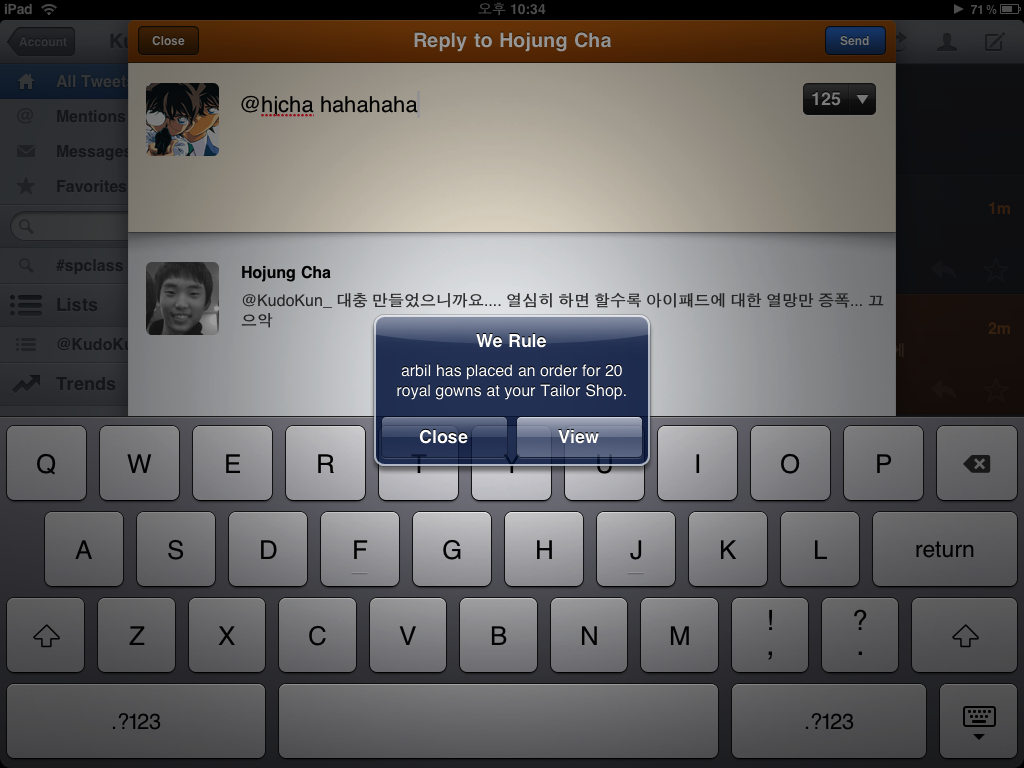
Many people will agree on this: iOS has the WORST notification system, period. Just in case if you haven’t used iOS before, here’s a quick refresher course: when there’s a notification, whatever you have been doing stops, and a popup message appears. You have to actually stop what you have been doing, and either check the message, or ignore it. Let’s say you are about to finally kill off the boss in a game. Right at that time, a popup shows up. And right after you close it, the boss kills you. F&^k! (Mind you, that never happened to me, fortunately.) I was eventually annoyed by it, and turned off the alerts in Settings. And now, the sounds comes out when I get something, but I have no idea in hell what it is.
From what I can perceive, every single mobile OS has better notification system than iOS. They’re all similar actually: when the notification arrives, it shows you on a corner of screen, with a little of what it is. Then, after a while, it disappears, but still you can access it on notification tray, after you’re done with whatever you’ve been doing. However, the best implementation of this simple idea is Palm’s webOS. Palm actually took this idea further by putting the notification area at the bottom. Why is that, you may ask. If you think about your usual habits of using a smartphone, (if you have one) you’ll find that your fingers reside mostly at the bottom half of the screen. The notification area is there so that your finger travel distance is minimal. This is genius. (See the video of it in action.) Thankfully, Apple hired the guy who figured this system out last year, so we’ll see what happens.
Widgets

To be honest, widgets are on the bottom of my priority list. However, as I was using Android, it’s not a bad thing to have. The problem is, that the only way for iOS to update live information on its homescreen is badges on the app icon. That’s it. Hopefully, that’s where widgets will come in to reinforce that. Problem is, Apple may say that it will drain battery and chew up the CPU cycle. (Which was its primary reason not to have multitasking in the first place)
In conclusion, I honestly don’t care about iPhone 5. I don’t even think there will be much changes. Same design, with improvements mostly going under the hood. (Like the 3GS) However, what’s important is OS. iOS has to change. Apple, please change it.